
Introduction
Hello, this is Pike8. I have customized the look and feel of Cocoon’s Table of Contents with additional CSS. There are a lot of information about customizing the table of contents, and I tried some CSS I found, but I couldn’t find a good fit in the details, so I ended up customizing it myself while referring to them. I think that customizing not only the table of contents, but also the appearance of the page is a part where your individuality and persistence come out. I would be happy if the CSS introduced here can be used as a reference for your own customization.
Environments
- Cocoon: 2.6.0.3
- Skin: None
- Site icon font: Font Awesome 5
Table of Contents
Appearance
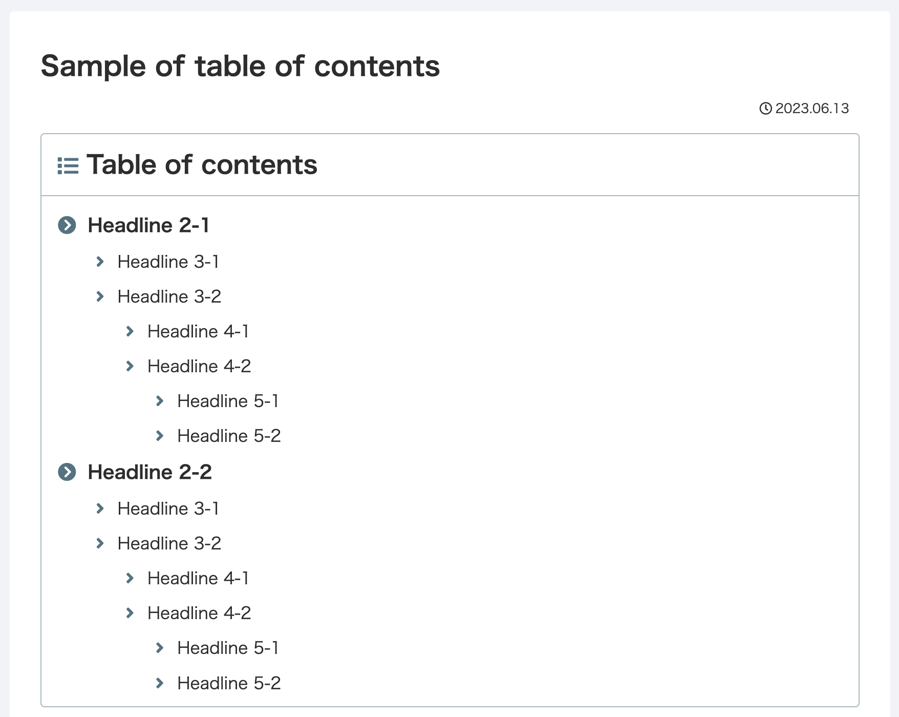
The table of contents in the articles looks like this
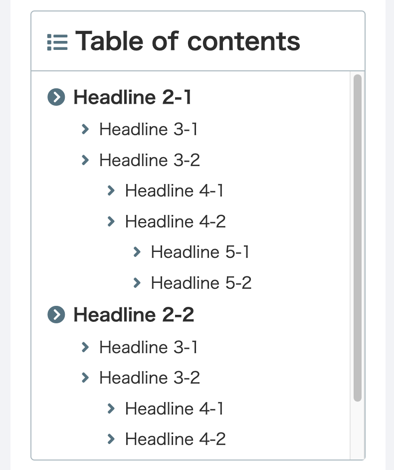
The table of contents in the sidebar looks like this
CSS
The following CSS is used as additional CSS for the table of contents.
:root {
  /* colors for icons, etc */
  --color-key: rgb(96, 125, 139);
  --color-key-alpha: rgba(96, 125, 139, .5);
}
.toc {
  /* border for entire table of contents in article */
  border: 1px solid var(--color-key-alpha);
  border-radius: 4px;
  padding: 0;
  display: block;
}
.nwa .toc {
  /* border for entire table of contents in sidebar */
  border: 1px solid var(--color-key-alpha);
  border-radius: 4px;
  padding: 0;
}
.toc-title {
  padding: 8px 16px;
  text-align: left;
  font-size: 24px;
  font-weight: bold;
}
.toc-title:before {
  /* icon before table of contents */
  font-family: "Font Awesome 5 Free";
  content: "\f03a";
  margin-right: 8px;
  font-size: 20px;
  color: var(--color-key);
}
.toc-content {
  padding: 8px 16px;
  /* separator line under the table of contents */
  border-top: 1px solid var(--color-key-alpha);
}
.sidebar .toc-content {
  /* change the table of contents in the sidebar to scrollable */
  overflow-y: auto;
  max-height: 390px;
}
.toc-content ol {
  position: relative;
}
.toc-content ol li {
  padding: 0em 0 0em 0.5em;
  list-style-type: none !important;
  /* overall margins for table of contents */
  margin: 0.3em;
}
.sidebar .toc-content ol li {
  /* overall margin for the table of contents in the sidebar */
  margin: 0.1em;
}
.toc-list>li>a::before {
  /* icon before H2 heading */
  font-family: "Font Awesome 5 Free";
  content: "\f138";
  position: absolute;
  left: 0;
  color: var(--color-key);
  font-weight: bold;
}
.toc-list>li li a::before {
  /* icon before H3 and later headings */
  font-family: "Font Awesome 5 Free";
  content: "\f105";
  position: absolute;
  left: 0.5em;
  color: var(--color-key);
  font-weight: bold;
}
.toc-list li a {
  /* emphasize H2 and later headings */
  font-size: 1.1em;
  font-weight: 600;
}
.toc-list>li li a {
  /* change H3 and later headings to standard */
  font-size: 1em;
  font-weight: 500;
}
Impression
One of the things to keep in mind when using CSS to change the look and feel of a website, not just the table of contents, is the behavior of browsers on different devices. Some of the CSS on the site that I referred to displayed well on the Mac’s Chrome, but was corrupted on the Mac’s Safari, iPhone’s Safari, and Chrome. Not being that knowledgeable about CSS, I have not investigated the detailed conditions of the broken display, but it appeared to be affected by the negative margins. When customizing the appearance with additional CSS, please pay attention to the differences in browser behavior on different devices.